K-means Clustering and Principal Component Analysis
February 23, 2018
Python machine learning matplotlibThis post covers the seventh exercise from Andrew Ng’s Machine Learning Course on Coursera.
Introduction
The K-means clustering algorithm will be implemented and applied to compress an image. In a second step, principal component analysis will be used to find a low-dimensional representation of face images.
K-means Clustering
K-means algorithm will be used for image compression. First, K-means algorithm will be applied in an example 2D dataset to help gain an intuition of how the algorithm works. After that, the K-means algorithm will be used for image compression by reducing the number of colours that occur in an image to only those that are most common in that image.
Implementing K-means
The K-means algorithm is a method to automatically cluster similar data examples together. Concretely, a given training set $\left\{x^{(1)},\dots,x^{(m)}\right\} \left(\text{ where } x^{(i)} \in \mathbb{R}^n \right)$ will be grouped into a few cohesive “clusters”. The intuition behind K-means is an iterative procedure that starts by guessing the initial centroids, and then refines this guess by repeatedly assigning examples to their closest centroids and then recomputing the centroids based on the assignments.
The inner-loop of the algorithm repeatedly carries out two steps:
- Assigning each training example
$x^{(i)}$to its closest centroid, and - Recomputing the mean of each centroid using the points assigned to it.
The K-means algorithm will always converge to some final set of means for the centroids. Note that the converged solution may not always be ideal and depends on the initial setting of the centroids. Therefore, in practice the K-means algorithm is usually run a few times with different random initializations. One way to choose between these different solutions from different random initializations is to choose the one with the lowest cost function value (distortion).
Finding Closest Centroids
In the “cluster assignment” phase of the K-means algorithm, the algorithm assigns every training example $x^{(i)}$ to its closest centroid, given the current positions of centroids. Specifically, for every example $i$ it is set
$$c^{(i)} := j \text{ that minimizes } \lVert x^{(i)}-\mu_j \rVert^2,$$
where $c^{(i)}$ is the index of the centroid that is closest to $x^{(i)}$, and $\mu_j$ is the position (value) of the j’th centroid. Note that $c^{(i)}$ corresponds to $idx[i]$ in the code in findClosestCentroids. This function takes the data matrix $X$ and the locations of all centroids inside centroids and should output a one-dimensional array $idx$ that holds the index (a value in $\left\{1,...,K\right\}$, where $K$ is total number of centroids) of the closest centroid to every training example. This can be implemented by using a loop over every training example and every centroid.
import numpy as np
from scipy.io import loadmat
import matplotlib.pyplot as plt

# Load dataset.
data = loadmat('ex7data2.mat')
X = data["X"]

# Select an initial set of centroids
K = 3 # 3 Centroids
initial_centroids = np.array([[3, 3], [6, 2], [8, 5]])

# Create a function to find the closest centroids.
def findClosestCentroids(X, centroids):
    """
    Returns the closest centroids in idx for a dataset X
    where each row is a single example. idx = m x 1 vector
    of centroid assignments (i.e. each entry in range [1..K])
    Args:
        X        : array(# training examples, n)
        centroids: array(K, n)
    Returns:
        idx      : array(# training examples, 1)
    """
    # Set K size.
    K = centroids.shape[0]

    # Initialise idx.
    idx = np.zeros((X.shape[0], 1), dtype=np.int8)

    # Iterate over every example, find its closest centroid, and store
    # the index inside idx at the appropriate location. Concretely,
    # idx[i] should contain the index of the centroid closest to
    # example i. Hence, it should be a value in the range 1..K.

#     # Iterate over training examples.
#     for i in range(X.shape[0]):
#         # Set norm distance to infinity.
#         min_dst = math.inf
#         # Iterate over centroids.
#         for k in range(K):
#             # Compute the norm distance.
#             dst = np.linalg.norm(X[i,:] - centroids[k,:], axis=0)
#             if dst < min_dst:
#                 min_dst = dst
#                 idx[i] = k

    # Alternative partial vectorized solution.
    # Iterate over training examples.
    for i in range(X.shape[0]):
        distances = np.linalg.norm(X[i] - centroids, axis=1)
        # argmin returns the indices of the minimum values along an axis,
        # replacing the need for a for-loop and if statement.
        min_dst = np.argmin(distances)
        idx[i] = min_dst

    return idx


# Find the closest centroids for the examples.
idx = findClosestCentroids(X, initial_centroids)

print('Closest centroids for the first 3 examples: \n')
print(idx[:3])
print('\n(The closest centroids should be 0, 2, 1 respectively)')
Closest centroids for the first 3 examples:

[[0]
 [2]
 [1]]

(The closest centroids should be 0, 2, 1 respectively)
Computing Centroid Means
Given assignments of every point to a centroid, the second phase of the algorithm recomputes, for each centroid, the mean of the points that were assigned to it. Specifically, for every centroid k it is set
$$ \mu_k := \frac{1}{\left|C_k\right|} \sum_{i \in C_k} x^{(i)} $$
where $C_k$ is the set of examples that are assigned to centroid $k$. Concretely, if two examples say $x^{(3)}$ and $x^{(5)}$ are assigned to centroid $k = 2$, then it should be updatet $\mu_2 = \frac{1}{2} \left(x^{(3)} + x^{(5)}\right)$.
The code in computeCentroids implements this function using a loop over the centroids. The code may run faster if it uses a vectorized implementation instead of a loop over the examples.
# Create a function to compute the new centroids.
def computeCentroids(X, idx, K):
    """
    Returns the new centroids by computing the means
    of the data points assigned to each centroid. It is
    given a dataset X where each row is a single data point,
    a vector idx of centroid assignments (i.e. each entry
    in range [1..K]) for each example, and K, the number of
    centroids. A matrix centroids is returned, where each row
    of centroids is the mean of the data points assigned to it.
    Args:
        X        : array(# training examples, 2)
        idx      : array(# training examples, 1)
        K        : int, # of centroids
    Returns:
        centroids: array(# of centroids, 2)
    """
    # Create useful variables
    m, n = X.shape

    # Initialize centroids matrix.
    centroids = np.zeros((K, n))
    # Iterate over every centroid and compute mean of all points that
    # belong to it. Concretely, the row vector centroids[k,:] should
    # contain the mean of the data points assigned to centroid k.

#     # Iterate over centroids.
#     for k in range(K):
#         # Iterate over training examples.
#         for i in range(m):
#             if idx[i] == k:
#                 points = X[i]
#                 centroids[k] = np.mean(points, axis=0)

    # Alternative partial vectorized solution.
    for k in range(K):
        centroids[k, :] = np.mean(X[idx.ravel() == k, :], axis=0)

    return centroids

# Compute means based on the closest centroids found in the previous part.
centroids = computeCentroids(X, idx, K)

print('Centroids computed after initial finding of closest centroids: \n')
print(centroids)
print('\nThe centroids should be:\n')
print('[ 2.42830111  3.15792418 ]')
print('[ 5.81350331  2.63365645 ]')
print('[ 7.11938687  3.6166844 ]')
Centroids computed after initial finding of closest centroids:

[[ 2.42830111  3.15792418]
 [ 5.81350331  2.63365645]
 [ 7.11938687  3.6166844 ]]

The centroids should be:

[ 2.42830111  3.15792418 ]
[ 5.81350331  2.63365645 ]
[ 7.11938687  3.6166844 ]
K-means on Example Dataset
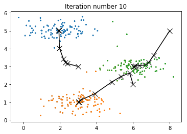
After implementing the two functions (findClosestCentroids and computeCentroids), the next step is to run the K-means algorithm on a toy 2D dataset to see how K-means works. The functions are called from inside the runKmeans script. Notice that the code calls the two functions in a loop.
A visualization of the progress of the algorithm at each iteration is shown in the next figure.
# Create a function to plot the data points.
def plotDataPoints(X, idx, K):
    """
    Plots data points in X, coloring them so that those
    with the same index assignments in idx have the same color
    Args:
        X  : array(# training examples, 2)
        idx: array(# training examples, 1)
        K  : int, # of centroids
    """
    # Create a colors list.
    colors = [plt.cm.tab20(float(i) / 10) for i in idx]

    # Plot the data.
    plt.scatter(X[:,0], X[:,1], c=colors, alpha=0.5, s=2)

# Create a function to display the progress of K-Means.
def plotProgresskMeans(X, centroids, previous, idx, K, i):
    """
    Plots the data points with colors assigned to each centroid.
    With the previous centroids, it also plots a line between the
    previous locations and current locations of the centroids.
    Args:
        X        : array(# training examples, n)
        centroids: array(# of centroids, n)
        previous : array(# of centroids, n)
        idx      : array(# training examples, 1)
        K        : int, # of centroids
        i        : # of iterations
    """
    # Plot the examples.
    plotDataPoints(X, idx, K)

    # Plot the centroids as black x's.
    plt.scatter(centroids[:,0], centroids[:,1],
                marker='x', c='k', s=100, linewidth=1)

    # Plot the history of the centroids with lines.
    for j in range(centroids.shape[0]):
        plt.plot([centroids[j, :][0], previous[j, :][0]],
                 [centroids[j, :][1], previous[j, :][1]], c='k')
    # Title
    plt.title('Iteration number {:d}'.format(i+1))

# Create a function to run the K-means algorithm.
def runkMeans(X, initial_centroids, max_iters, plot_progress):
    """
    Runs the K-Means algorithm on data matrix X, where each row of X
    is a single example. It uses initial_centroids used as the initial
    centroids. max_iters specifies the total number of interactions
    of K-Means to execute. plot_progress is a true/false flag that
    indicates if the function should also plot its progress as the
    learning happens. This is set to false by default. runkMeans returns
    centroids, a K x n matrix of the computed centroids and idx, a m x 1
    vector of centroid assignments (i.e. each entry in range [1..K])
    Args:
        X                : array(# training examples, n)
        initial_centroids: array(# of centroids, n)
        max_iters        : int, # of iterations
        plot_progress    : boolean, default set to False
    Returns:
        centroids        : array(# of centroids, n)
        idx              : array(# training examples, 1)
    """
    # Initialize values.
    m, n = X.shape
    K = initial_centroids.shape[0]
    centroids = initial_centroids
    previous_centroids = centroids
    idx = np.zeros((m, 1))

    # Run K-Means.
    # Turn interactive mode on to refresh the plot and generate one final plot.
    plt.ion()
    for i in range(max_iters):
        # Output progress.
        print('K-Means iteration {}/{}...'.format(i, max_iters))

        # For each example in X, assign it to the closest centroid
        idx = findClosestCentroids(X, centroids)

        # Optionally, plot progress here.
        if plot_progress:
            plotProgresskMeans(X, centroids, previous_centroids, idx, K, i)
            previous_centroids = centroids

        # Given the memberships, compute new centroids.
        centroids = computeCentroids(X, idx, K)

    return centroids, idx

# Set K-Means variables.
K = 3
max_iters = 10

# For consistency, here we set centroids to specific values
# but in practice we generate them automatically, such as by
# setting them to be random examples.
initial_centroids = np.array([[3, 3], [6, 2], [8, 5]])

# Run K-Means algorithm.
centroids, idx = runkMeans(X, initial_centroids, max_iters, plot_progress=True)
print('\nK-Means Done.')
K-Means iteration 0/10...
K-Means iteration 1/10...
K-Means iteration 2/10...
K-Means iteration 3/10...
K-Means iteration 4/10...
K-Means iteration 5/10...
K-Means iteration 6/10...
K-Means iteration 7/10...
K-Means iteration 8/10...
K-Means iteration 9/10...

K-Means Done.
Random Initialization
A good strategy for initializing the centroids is to select random examples from the training set. The code in the function kMeansInitCentroids first randomly permutes the indices of the examples. Then, it selects the first K examples based on the random permutation of the indices. This allows the examples to be selected at random without the risk of selecting the same example twice.
# Create a function to initialize centroids.
def kMeansInitCentroids(X, K):
    """
    Initializes K centroids that are to be
    used in K-Means on the dataset X.
    Args:
        X                : array(# training examples, n)
        K                : int, # of centroids
    Returns:
        initial_centroids: array(# of centroids, n)
    """
    # Init centroids.
    centroids = np.zeros((K, X.shape[1]))

    # Randomly reorder the indices of examples.
    randidx = np.random.permutation(X.shape[0])
    # Take the first K examples as centroids.
    centroids = X[randidx[:K], :]

    return centroids

# Set K-Means variables.
K = 3
max_iters = 10

initial_centroids = kMeansInitCentroids(X, K)

# Run K-Means algorithm.
centroids, idx = runkMeans(X, initial_centroids, max_iters, plot_progress=True)
print('\nK-Means Done.')
K-Means iteration 0/10...
K-Means iteration 1/10...
K-Means iteration 2/10...
K-Means iteration 3/10...
K-Means iteration 4/10...
K-Means iteration 5/10...
K-Means iteration 6/10...
K-Means iteration 7/10...
K-Means iteration 8/10...
K-Means iteration 9/10...

K-Means Done.
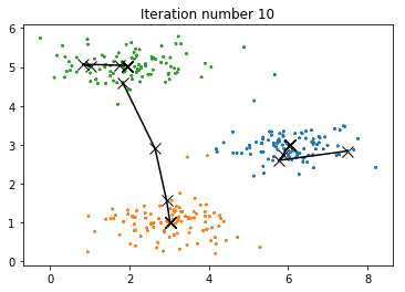
Image Compression with K-means
K-means will be applied to image compression. In a straightforward 24-bit color representation of an image, each pixel is represented as three 8-bit unsigned integers (ranging from 0 to 255) that specify the red, green and blue intensity values. This encoding is often refered to as the RGB encoding. A sample 24-bit color image contains thousands of colors, which can be reduced to 16 colors.
By making this reduction, it is possible to represent (compress) the photo in an efficient way. Specifically, there is only need to store the RGB values of the 16 selected colors, and for each pixel in the image now it is needed to only store the index of the color at that location (where only 4 bits are necessary to represent 16 possibilities).
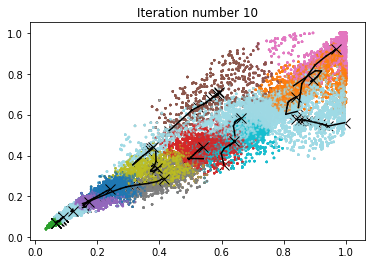
The K-means algorithm will be applied to select the 16 colors that will be used to represent the compressed image. Concretely, every pixel will be treated in the original image as a data example and the K-means algorithm will be used to find the 16 colors that best group (cluster) the pixels in the 3-dimensional RGB space. Once the cluster centroids have been computed on the image, then the 16 colors will be used to replace the pixels in the original image.
K-means on Pixels
The following code first loads the image, and then reshapes it to create a $m \times 3$ matrix of pixel colors $\left( \text{where } m = 16384 = 128 \times 128 \right)$, and calls the K-means function on it.
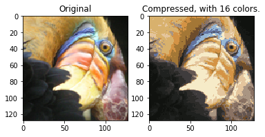
After finding the top K = 16 colors to represent the image, each pixel position can now be assigned to its closest centroid using the findClosestCentroids function. This allows to represent the original image using the centroid assignments of each pixel. Notice that the number of bits that are required to describe the image have been significantly reduced. The original image required 24 bits for each one of the $128\times128$ pixel locations, resulting in total size of $128\times128\times24 = 393,216$ bits. The new representation requires some overhead storage in form of a dictionary of 16 colors, each of which require 24 bits, but the image itself then only requires 4 bits per pixel location. The final number of bits used is therefore $16\times24 + 128\times128\times4 = 65,920$ bits, which corresponds to compressing the original image by about a factor of 6.
Finally, the effects of the compression can be viewed by reconstructing the image based only on the centroid assignments. Specifically, each pixel location can be replaced with the mean of the centroid assigned to it. Even though the resulting image retains most of the characteristics of the original, we also see some compression artifacts.
from PIL import Image

print('Running K-Means clustering on pixels from an image.')

# Load an image of a bird.
A = Image.open('bird_small.png')
A = np.array(A) # array(128, 128, 3)

# Divide by 255 so that all values are in the range 0-1.
A = A / 255

# Get the size of the image.
img_size = A.shape

# Reshape the image into an Nx3 matrix where N = number of pixels.
# Each row will contain the Red, Green and Blue pixel values
# This gives the dataset matrix X_img that will be used K-Means on.
X_img = A.reshape(img_size[0] * img_size[1], 3)

# Run K-Means algorithm on this data.
# Different values of K and max_iters can be tried here.
K = 16
max_iters = 10

# When using K-Means, it is important the initialize the centroids randomly.
initial_centroids = kMeansInitCentroids(X_img, K)

# Run K-Means.
centroids, idx = runkMeans(X_img, initial_centroids, max_iters, plot_progress=True)
Running K-Means clustering on pixels from an image.
K-Means iteration 0/10...
K-Means iteration 1/10...
K-Means iteration 2/10...
K-Means iteration 3/10...
K-Means iteration 4/10...
K-Means iteration 5/10...
K-Means iteration 6/10...
K-Means iteration 7/10...
K-Means iteration 8/10...
K-Means iteration 9/10...
print('Applying K-Means to compress an image.')

# Find closest cluster members.
idx = findClosestCentroids(X_img, centroids)

# Essentially, now the image X is represented as in terms of the indices in idx.
# The image can be recoverd from the indices (idx) by mapping each pixel
# (specified by it's index in idx) to the centroid value.
X_recovered = centroids[idx,:]

# Reshape the recovered image into proper dimensions.
X_recovered = X_recovered.reshape(img_size[0], img_size[1], 3)

# Display the original image
plt.subplot(1, 2, 1)
plt.imshow(A)
plt.title('Original')

# Display compressed image side by side
plt.subplot(1, 2, 2)
plt.imshow(X_recovered)
plt.title('Compressed, with {} colors.'.format(K))
plt.show()
Applying K-Means to compress an image.
Principal Component Analysis
In this part, Principal Component Analysis (PCA) will be applied to perform dimensionality reduction. First an example $2D$ dataset will be tested to get intuition on how PCA works, and a bigger dataset of 5000 face images will be used.
Example Dataset
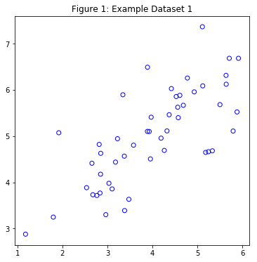
To understand how PCA works, a $2D$ dataset which has one direction of large variation and one of smaller variation will be tested. First, the training data will be plotted (Figure 1). Visualize will help to understand what happens when PCA is applied to reduce the data from $2D$ to $1D$. In practice, data may even be reduced for example from 256 to 50 dimensions, but using lower dimensional data in this example allows to visualize the algorithms better.
import numpy as np
from scipy.io import loadmat
import matplotlib.pyplot as plt

# Load dataset.
data = loadmat('ex7data1.mat')
X = data["X"]

plt.figure(figsize=(6, 6))
plt.scatter(X[:,0], X[:,1], edgecolors='b', facecolors='none')
plt.title("Figure 1: Example Dataset 1")
plt.show()
Implementing PCA
PCA consists of two computational steps: First, the covariance matrix of the data is computed, which is given by:
$$ \Sigma = \frac{1}{m} X^T X$$
where $X$ is the data matrix with examples in rows, and $m$ is the number of examples. Note that $\Sigma$ is a $n \times n$ matrix and not the summation operator.
Then, the eigenvectors $U_1, U_2,\dots, U_n$ are computed. These will correspond to the principal components of variation in the data.
Before using PCA, it is important to first normalize the data by subtracting the mean value of each feature from the dataset, and scaling each dimension so that they are in the same range. After normalizing the data, PCA is run to compute the principal components.
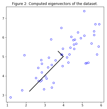
The corresponding principal components found are shown in Figure 2. Also the top principal component (eigenvector) found are printed (an output of about (-0.707 -0.707) is expected).
import scipy.linalg as linalg

# Create a function to normalize features.
def featureNormalize(X):
    """
    Returns a normalized version of X where the mean
    value of each feature is 0 and the standard deviation
    is 1. This is often a good preprocessing step to do
    when working with learning algorithms.
    Args:
        X     : array(# of training examples, n)
    Returns:
        X_norm: array(# of training examples, n)
        mu    : array(n,)
        sigma : array(n,)
    """
    mu = np.mean(X, axis=0)
    X_norm = X - mu
    # Set Delta Degrees of Freedom (ddof) to 1, to compute
    # the std based on a sample and not the population.
    sigma = np.std(X_norm, axis=0, ddof=1)
    X_norm = X_norm / sigma

    return X_norm, mu, sigma

# Create a function to compute the eigenvectors and eigenvalues.
def pca(X):
    """
    Returns the eigenvectors U, the eigenvalues (on diagonal) in S.
    Args:
        X: array(# of training examples, n)
    Returns:
        U: array(n, n)
        S: array(n, n)
    """
    # Get some useful values
    m, n = X.shape

    # Init U and S.
    U = np.zeros(n)
    S = np.zeros(n)

    # When computing the covariance matrix, we have
    # to divide by m (the number of examples).
    sigma = (1. / m) * np.dot(X.T, X)

    # Compute the eigenvectors and eigenvalues
    # of the covariance matrix.
    U, S, V = linalg.svd(sigma)
    S = linalg.diagsvd(S, len(S), len(S))

    return U, S

# Normalize X.
X_norm, mu, _ = featureNormalize(X)

# Run PCA.
U, S = pca(X_norm)

# Draw the eigenvectors centered at mean of data. These lines show the
# directions of maximum variations in the dataset.
plt.figure(figsize=(6, 6))
plt.scatter(X[:,0], X[:,1], edgecolors='b', facecolors='none')
plt.title("Figure 2: Computed eigenvectors of the dataset.")
# Compute the pairs of points to draw the lines.
p1 = mu
p2 = mu + 1.5 * S[0,0] * U[:,0].T
p3 = mu + 1.5 * S[1,1] * U[:,1].T
plt.plot([p1[0], p2[0]], [p1[1], p2[1]], c='k', linewidth=2)
plt.plot([p1[0], p3[0]], [p1[1], p3[1]], c='k', linewidth=2)
plt.show()

print('Top eigenvector:')
print('U[:,0]= {:f} {:f}'.format(U[0,0], U[1,0]))
print('(expected to see -0.707107 -0.707107)')
Top eigenvector:
U[:,0]= -0.707107 -0.707107
(expected to see -0.707107 -0.707107)
Dimensionality Reduction with PCA
The principal component can be used now to reduce the feature dimension of the dataset by projecting each example onto a lower dimensional space, $x^{(i)} \rightarrow z^{(i)}$ (e.g., projecting the data from $2D$ to $1D$). In practice, if a learning algorithm such as linear regression or perhaps neural networks is applied, the projected data can be used instead of the original data. By using the projected data, the model is trained faster as there are less dimensions in the input.
Projecting the Data onto the Principal Components
The code in projectData uses a dataset $X$, the principal components $U$, and the desired number of dimensions to reduce to $K$. Each example in $X$ is projected onto the top $K$ components in $U$. Note that the top $K$ components in $U$ are given by the first $K$ columns of $U$, that is U_reduce = U(:,:K).
Reconstructing an Approximation of the Data
After projecting the data onto the lower dimensional space, data can be approximately recovered by projecting them back onto the original high dimensional space. The code in recoverData projects each example in $Z$ back onto the original space and return the recovered approximation in X_rec.
Visualizing the Projections
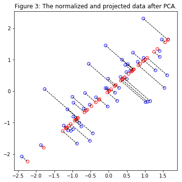
In Figure 3, the original data points are indicated with the blue circles, while the projected data points are indicated with the red circles. The projection effectively only retains the information in the direction given by $U_1$.
# Create a function to project the data.
def projectData(X, U, K):
    """
    Computes the projection of the normalized inputs X
    into the reduced dimensional space spanned by the first
    K columns of U. It returns the projected examples in Z.
    Args:
        X: array(# of training examples, n)
        U: array(n, n)
        K: int, # of dimensions
    Returns:
        Z: array(# of training examples, K)
    """
    # Init Z.
    Z = np.zeros((X.shape[0], K)) # m * K

    # Compute the projection of the data using only
    # the top K eigenvectors in U (first K columns).
    U_reduce = U[:,:K]
    Z = np.dot(X, U_reduce)

    return Z

# Create a function to recover the data.
def recoverData(Z, U, K):
    """
    Recovers an approximation the original data
    that has been reduced to K dimensions.
    It returns the approximate reconstruction in X_rec.
    Args:
        Z    : array(# of training examples, K)
        U    : array(n, n)
        K    : int, # of dimensions
    Returns:
        X_rec: array(# of training examples, n)
    """
    # Init X_rec.
    X_rec = np.zeros((Z.shape[0], U.shape[0]))

    # Compute the approximation of the data by projecting back
    # onto the original space using the top K eigenvectors in U.
    U_reduce = U[:,: K]
    X_rec = np.dot(Z, U_reduce.T)

    return X_rec

# Project the data onto K = 1 dimension.
K = 1
Z = projectData(X_norm, U, K)
print('Projection of 1st example: %.6f'% Z[0])
print('(this value should be about 1.481274)')

X_rec = recoverData(Z, U, K)
print('\nApproximation of 1st example: {0:.6f} {0:.6f}'.format(X_rec[0,0], X_rec[0,1]))
print('(this value should be about  -1.047419 -1.047419)')

# Draw the normalized X dataset.
plt.figure(figsize=(6, 6))
plt.scatter(X_norm[:,0], X_norm[:,1], edgecolors='b', facecolors='none')
plt.title("Figure 3: The normalized and projected data after PCA.")
# Draw the projected points.
plt.scatter(X_rec[:,0], X_rec[:,1], edgecolors='r', facecolors='none')
# Draw lines connecting the projected points to the original points.
for i in range(X_norm.shape[0]):
    plt.plot([X_norm[i,:][0], X_rec[i,:][0]],
             [X_norm[i,:][1], X_rec[i,:][1]],
             linestyle='--', color='k', linewidth=1)
plt.show()
Projection of 1st example: 1.481274
(this value should be about 1.481274)

Approximation of 1st example: -1.047419 -1.047419
(this value should be about  -1.047419 -1.047419)
Face Image Dataset
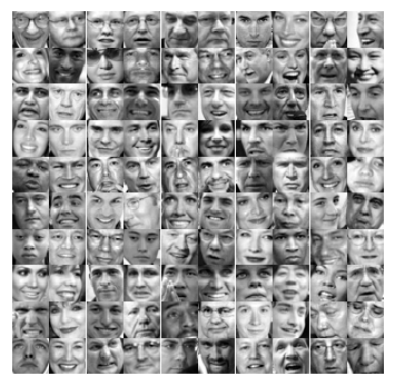
PCA will applied on face images to see how it can be used in practice for dimension reduction. The dataset ex7faces.mat contains a dataset $X$ of face images, each $32 \times 32$ in grayscale. Each row of $X$ corresponds to one face image (a row vector of length 1024). Next figure shows the first 100 of these face images.
# Load faces dataset.
data = loadmat('ex7faces.mat')
X = data["X"]

print("Shape of X: ", X.shape)

def displayData(X, n):
    """
    Select the first n rows from X,
    plot them as (length of image vector x length of image vector)
    pixel grayscale images, and combine them to one figure.
    Args:
        X: array(# of training examples, length of image vector)
        n: int
    """
    # Create nxn subplots and remove the gaps
    # between the subplots with gridspec.
    fig, axarr = plt.subplots(n, n,
                             figsize=(6, 6),
                             gridspec_kw={'wspace':0,
                                          'hspace':0})
    idx = 0
    for i in range(n):
        for j in range(n):
            # Index the array X with the indices.
            pixels = X[idx] # shape(1, length of image vector)
            pixels = pixels.reshape(-1, 32) # shape(32, 32)
            axarr[i,j].imshow(pixels.T, cmap='gray')
            # Remove ticks.
            axarr[i,j].set_xticks([])
            axarr[i,j].set_yticks([])
            # Turn off axes.
            axarr[i,j].axis('off')
            idx += 1
    plt.show()

displayData(X, 10)
Shape of X: (5000, 1024)
PCA on Faces
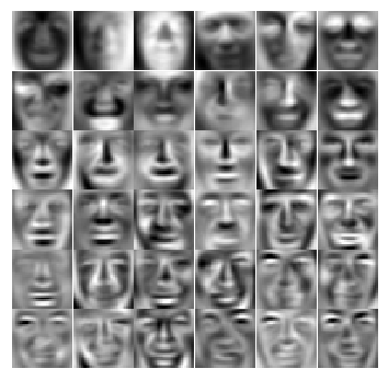
To run PCA on the face dataset, first the dataset is normalized by subtracting the mean of each feature from the data matrix $X$. After running PCA, the principal components of the dataset are obtained. Notice that each principal component in $U$ (each row) is a vector of length $n$ (where for the face dataset, $n = 1024$). It turns out that these principal components can be visualized by reshaping each of them into a $32 \times 32$ matrix that corresponds to the pixels in the original dataset. Next the first 36 principal components that describe the largest variations are displayed.
print('Running PCA on face dataset...')

# Before running PCA, it is important to first normalize X
# by subtracting the mean value from each feature.
X_norm, _, _ = featureNormalize(X)

# Run PCA.
U, S = pca(X_norm)

# Visualize the top 36 eigenvectors found.
displayData(U.T, 6)
Running PCA on face dataset...
Dimensionality Reduction
Now principal components can be used to reduce the dimension of the face dataset. This allows to use the learning algorithm with a smaller input size (e.g., 100 dimensions) instead of the original 1024 dimensions. This can help speed up the learning algorithm.
Next the face dataset will be projected onto only the first 100 principal components. Concretely, each face image is now described by a vector $z^{(i)} \in \mathbb{R}^{100}$.
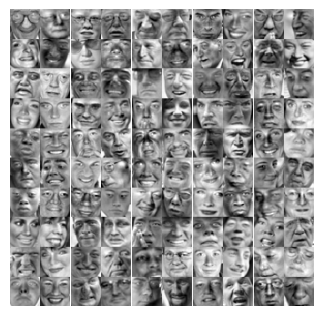
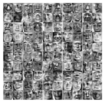
To understand what is lost in the dimension reduction, the data can be recovered using only the projected dataset. An approximate recovery of the data is performed and the original and projected face images are displayed in the next figure. From the reconstruction, it can be observed that the general structure and appearance of the face are kept while the fine details are lost. This is a remarkable reduction (more than $10\times$) in the dataset size that can help speed up the learning algorithm significantly. For example, if a neural network was being trained to perform person recognition (given a face image, predict the identitfy of the person), the dimension reduced input of only a 100 dimensions can be used instead of the original pixels.
print('Dimension reduction for face dataset...')

K = 100
Z = projectData(X_norm, U, K)

print('\nThe projected data Z has a size of: ')
print('{} {}'.format(Z.shape[0], Z.shape[1]))

print('\nVisualizing the projected (reduced dimension) faces.');

X_rec = recoverData(Z, U, K)

# Display normalized data.
print('\nOriginal faces:')
displayData(X_norm, 10)

# Display reconstructed data from only k eigenfaces.
print('\nRecovered faces:')
displayData(X_rec, 10)
Dimension reduction for face dataset...

The projected data Z has a size of:
5000 100

Visualizing the projected (reduced dimension) faces.

Original faces:
Recovered faces:
PCA for Visualization
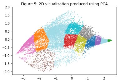
In K-means image compression, the K-means algorithm was used in the 3-dimensional RGB space. Next, the following code helps to visualize the final pixel assignments in this 3D space. Each data point is colored according to the cluster it has been assigned to. Mouse can be used on the interactive plotly figure in a Jupyter Notebook to rotate, zoom and inspect this data in 3 dimensions.
import plotly
import plotly.graph_objs as go

plotly.offline.init_notebook_mode(connected=True)

# One useful application of PCA is to use it to visualize high-dimensional
# data. In the last K-Means exercise K-Means was applied on 3-dimensional
# pixel colors of an image. First visualize this output in 3D, and then
# apply PCA to obtain a visualization in 2D.

# Setup color palette.
colors = np.array([plt.cm.tab20(float(i) / 10) for i in idx])

# Visualize the data and centroid memberships in 3D.
trace = go.Scatter3d(x=X_img[:,0], y=X_img[:,1], z=X_img[:,2],
                      mode='markers',
                      marker=dict(size=1.5, color=colors, opacity=0.3))

plotly.offline.iplot({'data': [trace],
                      'layout': {'title': 'Figure 4: Original data in 3D'}})
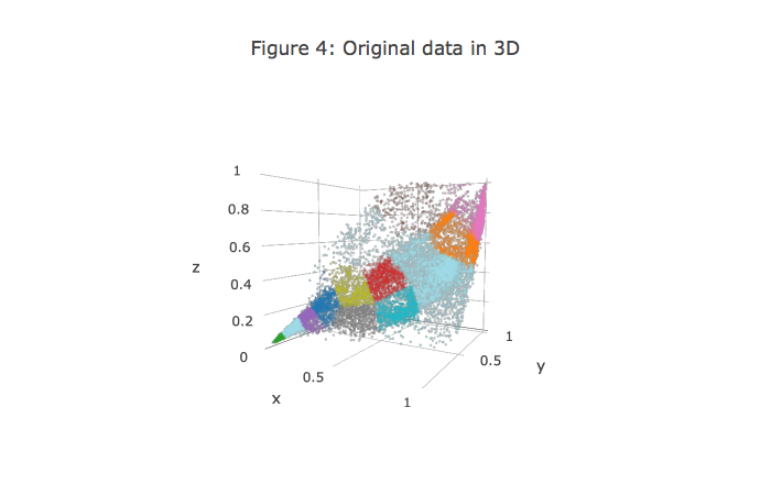
It turns out that visualizing datasets in 3 dimensions or greater can be cumbersome. Therefore, it is often desirable to only display the data in 2D even at the cost of losing some information. In practice, PCA is often used to reduce the dimensionality of data for visualization purposes. Next PCA will be applied to the 3-dimensional data to reduce it to 2 dimensions and visualize the result in a 2D scatter plot. The PCA projection can be thought of as a rotation that selects the view that maximizes the spread of the data, which often corresponds to the “best” view.
# Subtract the mean to use PCA.
X_norm, mu, sigma = featureNormalize(X_img)

# Apply PCA and project the data to 2D.
U, S = pca(X_norm)
Z = projectData(X_norm, U, 2)

# Plot in 2D.
plotDataPoints(Z, idx, K)
plt.title('Figure 5: 2D visualization produced using PCA')
plt.show()
